W2 Lab: Data processing basics and John Snow's map
Follow the contents of this notebook and answer all questions (e.g. Q1: ...)
Jupyter + Pandas = Awesomeness
Jupyter notebook (lab) (and IPython) and Pandas may be two most important libraries responsible for the Python's rise in data science. Jupyter lets you interactively explore datasets and code; Pandas lets you handle tabular datasets with superb speed and convenience. And they work so well together! In many cases, Jupyter and Pandas are all you need to load, clean, transform, visualize, and understand a dataset.
If you are not familiar with Pandas, you may want to follow their official tutorial called 10 Minutes to pandas now or in the near future.
Importing pandas
The convention for importing pandas is the following
import pandas as pd
You can check the version of the library. Because pandas is fast-evolving library, you want to make sure that you have the up-to-date version of the library.
pd.__version__
'1.1.5'
You also need matplotlib, which is used by pandas to plot figures. The following is the most common convention to import matplotlib library.
import matplotlib.pyplot as plt
Let's check its version too.
import matplotlib
matplotlib.__version__
'3.2.2'
Loading a CSV data file
Using pandas, you can read tabular data files in many formats and through many protocols. Pandas supports not only flat files such as .csv, but also various other formats including clipboard, Excel, JSON, HTML, Feather, Parquet, SQL, Google BigQuery, and so on. Moreover, you can pass a local file path or a URL. If it's on Amazon S3, just pass a url like s3://path/to/file.csv. If it's on a webpage, then just use https://some/url.csv.
Let's load a dataset about the location of pumps in the John Snow's map. You can download the file to your computer and try to load it using the local path too.
pump_df = pd.read_csv('https://raw.githubusercontent.com/yy/dviz-course/master/data/pumps.csv')
df stands for "Data Frame", which is a fundamental data object in Pandas. You can take a look at the dataset by looking at the first few lines.
pump_df.head()
| X | Y | |
|---|---|---|
| 0 | 8.651201 | 17.891600 |
| 1 | 10.984780 | 18.517851 |
| 2 | 13.378190 | 17.394541 |
| 3 | 14.879830 | 17.809919 |
| 4 | 8.694768 | 14.905470 |
Q1: can you print only the first three lines? Refer: http://pandas.pydata.org/pandas-docs/stable/index.html
# TODO: write your code here
| X | Y | |
|---|---|---|
| 0 | 8.651201 | 17.891600 |
| 1 | 10.984780 | 18.517851 |
| 2 | 13.378190 | 17.394541 |
You can also sample several rows randomly. If the data is sorted in some ways, sampling may give you a rather unbiased view of the dataset.
# Your code here
| X | Y | |
|---|---|---|
| 3 | 14.879830 | 17.809919 |
| 12 | 8.999440 | 5.101023 |
| 10 | 18.914391 | 9.737819 |
| 1 | 10.984780 | 18.517851 |
| 9 | 16.434891 | 9.252130 |
You can also figure out the number of rows in the dataset by running
len(pump_df)
13
Note that df.size does not give you the number of rows. It tells you the number of elements.
pump_df.size
26
You can also look into the shape of the dataset as well as what are the columns in the dataset.
pump_df.shape # 13 rows and 2 columns
(13, 2)
pump_df.columns
Index(['X', 'Y'], dtype='object')
You can also check out basic descriptive statistics of the whole dataset by using describe() method.
pump_df.describe()
| X | Y | |
|---|---|---|
| count | 13.000000 | 13.000000 |
| mean | 12.504677 | 11.963446 |
| std | 3.376869 | 4.957821 |
| min | 8.651201 | 5.046838 |
| 25% | 8.999440 | 7.958250 |
| 50% | 12.571360 | 11.727170 |
| 75% | 14.879830 | 17.394541 |
| max | 18.914391 | 18.517851 |
You can slice the data like a list
pump_df[:2]
| X | Y | |
|---|---|---|
| 0 | 8.651201 | 17.891600 |
| 1 | 10.984780 | 18.517851 |
pump_df[-2:]
| X | Y | |
|---|---|---|
| 11 | 16.00511 | 5.046838 |
| 12 | 8.99944 | 5.101023 |
pump_df[1:5]
| X | Y | |
|---|---|---|
| 1 | 10.984780 | 18.517851 |
| 2 | 13.378190 | 17.394541 |
| 3 | 14.879830 | 17.809919 |
| 4 | 8.694768 | 14.905470 |
or filter rows using some conditions.
pump_df[pump_df.X > 13]
| X | Y | |
|---|---|---|
| 2 | 13.378190 | 17.394541 |
| 3 | 14.879830 | 17.809919 |
| 8 | 13.521460 | 7.958250 |
| 9 | 16.434891 | 9.252130 |
| 10 | 18.914391 | 9.737819 |
| 11 | 16.005110 | 5.046838 |
Now let's load another CSV file that documents the cholera deaths. The URL is https://raw.githubusercontent.com/yy/dviz-course/master/data/deaths.csv
Q2: load the death dataset and inspect it
- load this dataset as
death_df. - show the first 2 rows.
- show the total number of rows.
# TODO: Remove below dummy dataframe and write your code here. You probably want to create multiple cells.
death_df = pd.DataFrame({"X": [2., 3.], "Y": [1., 2.]})
| X | Y | |
|---|---|---|
| 0 | 13.588010 | 11.09560 |
| 1 | 9.878124 | 12.55918 |
578
Some visualizations?
Let's visualize them! Pandas actually provides a nice visualization interface that uses matplotlib under the hood. You can do many basic plots without learning matplotlib. So let's try.
death_df.plot()
<matplotlib.axes._subplots.AxesSubplot at 0x7f8d56ea6a50>

This is not what we want! When asked to plot the data, it tries to figure out what we want based on the type of the data. However, that doesn't mean that it will successfully do so!
Oh by the way, depending on your environment, you may not see any plot. If you don't see anything run the following command.
%matplotlib inline
The commands that start with % is called the magic commands, which are available in IPython and Jupyter. The purpose of this command is telling the IPython / Jupyter to show the plot right here instead of trying to use other external viewers.
Anyway, this doesn't seem like the plot we want. Instead of putting each row as a point in a 2D plane by using the X and Y as the coordinate, it just created a line chart. Let's fix it. Please take a look at the plot method documentation. How should we change the command? Which kind of plot do we want to draw?
Yes, we want to draw a scatter plot using x and y as the Cartesian coordinates.
death_df.plot(x='X', y='Y', kind='scatter', label='Deaths')
<matplotlib.axes._subplots.AxesSubplot at 0x7f8d4fbb81d0>

I think I want to reduce the size of the dots and change the color to black. But it is difficult to find how to do that! It is sometimes quite annoying to figure out how to change how the visualization looks, especially when we use matplotlib. Unlike some other advanced tools, matplotlib does not provide a very coherent way to adjust your visualizations. That's one of the reasons why there are lots of visualization libraries that wrap matplotlib. Anyway, this is how you do it.
death_df.plot(x='X', y='Y', kind='scatter', label='Deaths', s=2, c='black')
<matplotlib.axes._subplots.AxesSubplot at 0x7f8d4f699f90>

Can we visualize both deaths and pumps?
death_df.plot(x='X', y='Y', s=2, c='black', kind='scatter', label='Deaths')
pump_df.plot(x='X', y='Y', kind='scatter', c='red', s=8, label='Pumps')
<matplotlib.axes._subplots.AxesSubplot at 0x7f8d4f5de6d0>

Oh well, this is not what we want! We want to overlay them to see them together, right? How can we do that? Before going into that, we probably want to understand some key components of matplotlib figures.
Figure and Axes
Why do we have two separate plots? The reason is that, by default, the plot method creates a new \emph{figure} instead of putting them inside a single figure. In order to avoid it, we need to either create an Axes and tell plot to use that axes. What is an axes? See this illustration.
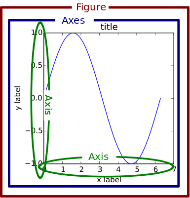
A figure can contain multiple axes (link). The figure below contains two axes:

and an axes can contain multiple plots (link).

Conveniently, when you call plot method, it creates an axes and returns it to you
ax = death_df.plot(x='X', y='Y', s=2, c='black', kind='scatter', label='Deaths')
ax
<matplotlib.axes._subplots.AxesSubplot at 0x7f8d4f503910>
This object contains all the information and objects in the plot we see. Whatever we want to do with this axes (e.g., changing x or y scale, overlaying other data, changing the color or size of symbols, etc.) can be done by accessing this object.
Then you can pass this axes object to another plot to put both plots in the same axes. Note ax=ax in the second plot command. It tells the plot command where to draw the points.
ax = death_df.plot(x='X', y='Y', s=2, c='black', alpha=0.5, kind='scatter', label='Deaths')
pump_df.plot(x='X', y='Y', kind='scatter', c='red', s=8, label='Pumps', ax=ax)
<matplotlib.axes._subplots.AxesSubplot at 0x7f8d4f4ccb90>

Although simply invoking the plot() command is quick and easy when doing an exploratory data analysis, it is usually better to be formal about figure and axes objects.
Here is the recommended way to create a plot. Call the subplots() method (see https://matplotlib.org/3.2.1/api/_as_gen/matplotlib.pyplot.subplots.html) to get the figure and axes objects explicitly.
As you can see below, subplots() creates an empty figure and returns the figure and axes object to you. Then you can fill this empty canvas with your plots. Whatever manipulation you want to make about your figure (e.g., changing the size of the figure) or axes (e.g., drawing a new plot on it) can be done with fig and ax objects. So whenever possible, use this method!
Now, can you use this method to produce the same plot just above?
import matplotlib.pyplot as plt
fig, ax = plt.subplots()

# your code here
<matplotlib.axes._subplots.AxesSubplot at 0x7f8d4f46ced0>
Voronoi diagram
Let's try the Voronoi diagram. You can use the scipy.spatial.Voronoi and scipy.spatial.voronoi_plot_2d from scipy, the scientific python library.
from scipy.spatial import Voronoi, voronoi_plot_2d
Take a look at the documentation of Voronoi and voronoi_plot_2d and
Q3: produce a Voronoi diagram that shows the deaths, pumps, and voronoi cells
# you'll need this
points = pump_df.values
points
array([[ 8.6512012, 17.8915997],
       [10.9847803, 18.5178509],
       [13.37819  , 17.3945408],
       [14.8798304, 17.8099194],
       [ 8.694768 , 14.9054699],
       [ 8.8644161, 12.75354  ],
       [12.5713596, 11.72717  ],
       [10.6609697,  7.428647 ],
       [13.5214596,  7.95825  ],
       [16.4348907,  9.2521296],
       [18.9143906,  9.7378187],
       [16.0051098,  5.0468378],
       [ 8.9994402,  5.1010232]])
# TODO: your code here

Saving the figure
You can also save your figure into PDF, PNG, etc. If you run the following, the plot will not only be displayed here, but also be saved as foo.png.
import matplotlib.pyplot as plt
plt.plot([1,2,3], [4,2,3])
plt.savefig('foo.png')

Q4: Save your Voronoi diagram. Make sure that your plot contains the scatterplot of deaths & pumps as well as the Voronoi cells
# TODO: your code here
Ok, that was a brief introduction to pandas and some simple visualizations. Now let's talk about web a little bit.
HTML & CSS Basics
HTML review
Webpages are written in a standard markup language called HTML (HyperText Markup Language). The basic syntax of HTML consists of elements enclosed within < and > symbols. Markup tags often come in a pair, the opening tag without / and the closing tag with /. For instance, when we assign the title of the webpage, we write <title>This is the title of the page</title>. You can find tutorials and references from many websites, including W3Schools. Here is an example of a simple HTML document (from w3schools homepage):
<!DOCTYPE html>
<html>
<title>HTML Tutorial</title>
<body>

<h1>This is a heading</h1>
<p>This is a paragraph.</p>

</body>
</html>
Here is a list of important tags and their descriptions.
<html>- Surrounds the entire document.<head>- Contains information about the document. E.g. the title, metadata, scripts to load, stylesheets, etc.<title>- Assigns title to the page. This is what you see in the tab and what you have when the page is bookmarked.<body>- The main part of the document.<h1>,<h2>,<h3>, ... - Headings (Smaller the number, larger the size).<p>- Paragraph. e.g.,<p>Here is a paragraph</p><br>- Line break.<em>- emphasize text.<strong>- Bold font.<a>- Defines a hyperlink and allows you to link out to the other webpages. See examples<img>- Place an image. See examples<ul>,<ol>,<li>- Unordered lists with bullets, ordered lists with numbers and each item in list respectively. See examples<table>- Make a table, specifying contents of each cell. See examples<!-->- Comments – will not be displayed.<span>- This will mark a certain part of text but will not necessarily change how they look. CSS or Javascript can access them and change how they look or behave.<div>- Similar to<span>, but used for a block that contains many elements.
CSS review
While HTML specifies the content and structure, it does not say how they should look.
CSS (Cascading Style Sheets) is the primary language that is used for the look and formatting of a web document. In the context of creating visualization, CSS becomes critical when you create web-based (Javascript-based) visualizations.
A CSS stylesheet consists of one or more selectors, properties and values. For example:
body {
    background-color: white;
    color: steelblue;
}
Selectors are the HTML elements to which the specific styles (combination of properties and values) will be applied. In the above example, all text within the body tags will be in steelblue.
There are three ways to include CSS code in HTML. This is called "referencing".
Embed CSS in HTML - You can place the CSS code within style tags inside the head tags. This way you can keep everything within a single HTML file but does make the code lengthy.
<head>
  <style type="text/css">
      .description {
      font: 16px times-new-roman;
      }
      .viz {
      font: 10px sans-serif;
      }
  </style>
</head>
Reference an external stylesheet from HTML is a much cleaner way but results in the creation of another file. To do this, you can copy the CSS code into a text file and save it as a .css file in the same folder as the HTML file. In the document head in the HTML code, you can then do the following:
<head>
  <link rel="stylesheet" href="main.css">
</head>
Attach inline styles - You can also directly attach the styles in-line along with the main HTML code in the body. This makes it easy to customize specific elements but makes the code very messy, because the design and content get mixed up.
<p style="color: green; font-size:36px; font-weight:bold;">Inline styles can be handy sometimes.</p>
%%html magic command in jupyter
You can use built-in magic command in jupyter notebook to render the cell as a block of HTML. You just need to add %%html at the beginning of the code cell, this command explicitly tells jupyter that the code in this cell will be html.
You can find more about magic commands in jupyter here: https://ipython.readthedocs.io/en/stable/interactive/magics.html#cellmagic-html
Below is an example of how to render html code in jupyter code cell:
%%html

<!DOCTYPE html>
<html>
    <head>
        <style>
            .para {
                font: 20px times-new-roman;
                color: green;
                padding: 10px;
                border: 1px solid black;
            }
        </style>
    </head>

    <body>
        <p class='para'>Hello World!</p>

        <!--
        You can also add an image in your html code
        <img src='location'/>
        -->

    </body>
</html>
Hello World!
Hello World!
Q5: Create a simple HTML page that displays the Voronoi diagram that you saved. Feel free to add more plots, explanations, and any styles. Make sure to open the HTML file in a browser to verify it renders correctly.
Btw, you can also export Jupyter notebook into various formats. Click File -> Export Notebook As and play with it.
Now submit your work
Submit the ipynb file. And the separate html (and css file if you have one) file you wrote for Q5 in Canvas. Don't worry if your images don't render in Canvas for your html. We can see the plots properly inside the Jupyter Notebook.
Make sure to rename your files in the following format.
lab02_notebook_lastname_firstname.ipynblab02_notebook_lastname_firstname.htmllab02_notebook_lastname_firstname.css<-- You don't need to have a CSS file, this only applies if you created one. (it's optional)